COMETS
CEREAL PACKAGING
COMETS is a local cereal brand from Mauritius that just opened production. They produce cereals that target mainly kids but the products can be consumed at any age. – fictional uni project
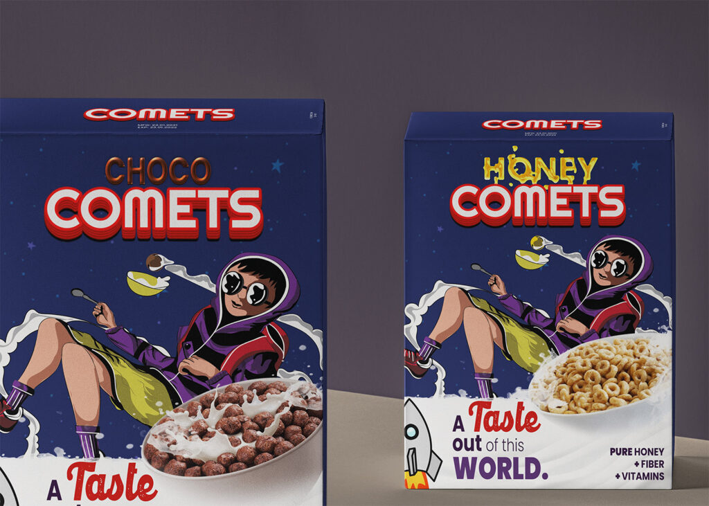
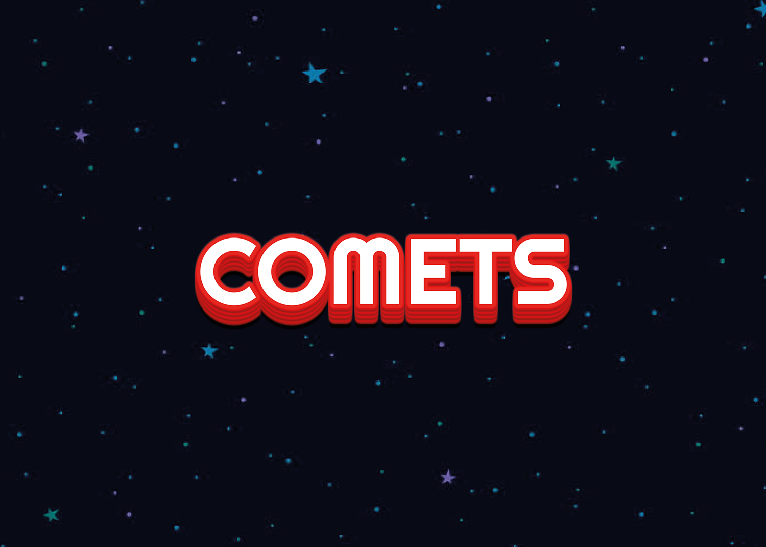
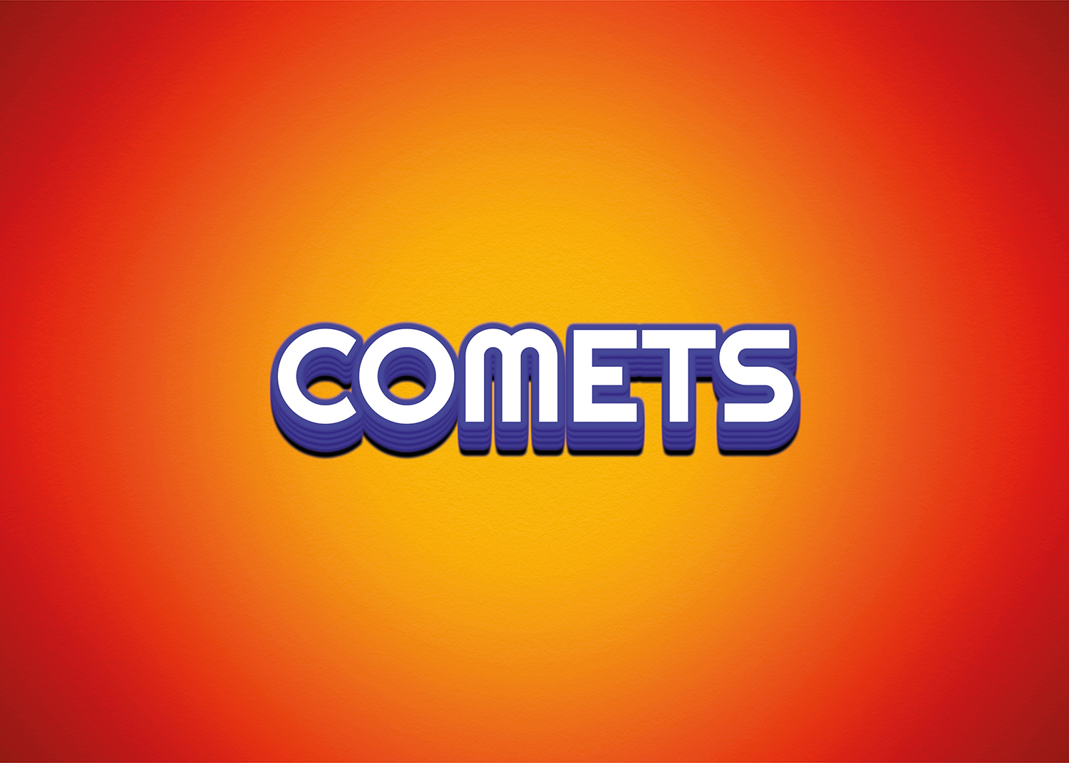
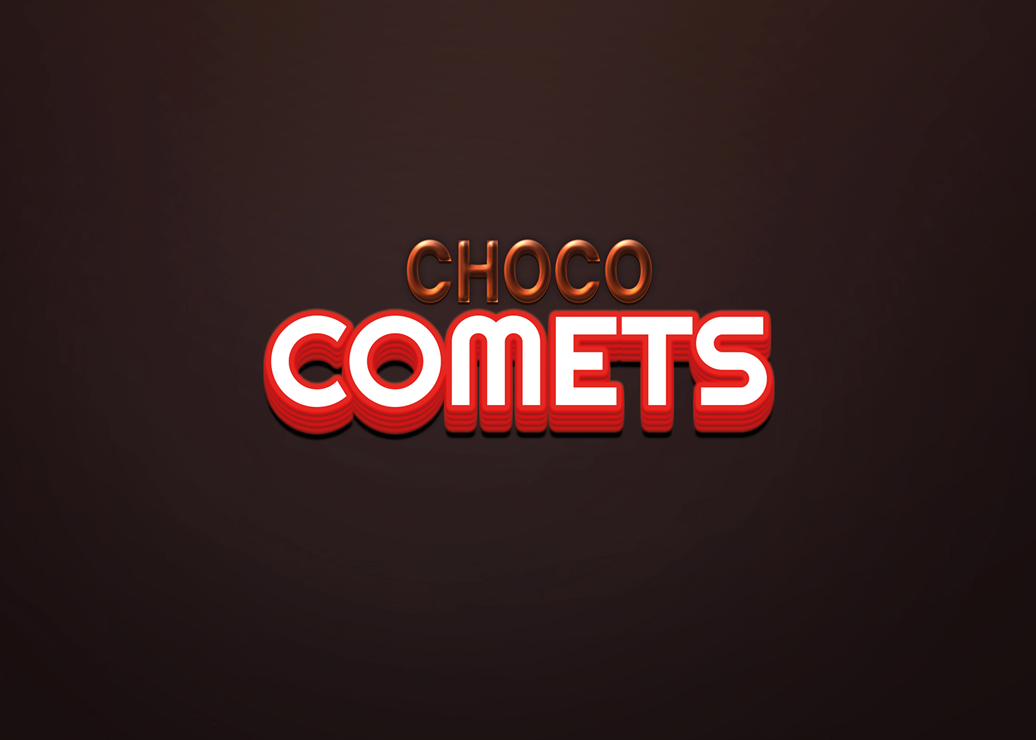
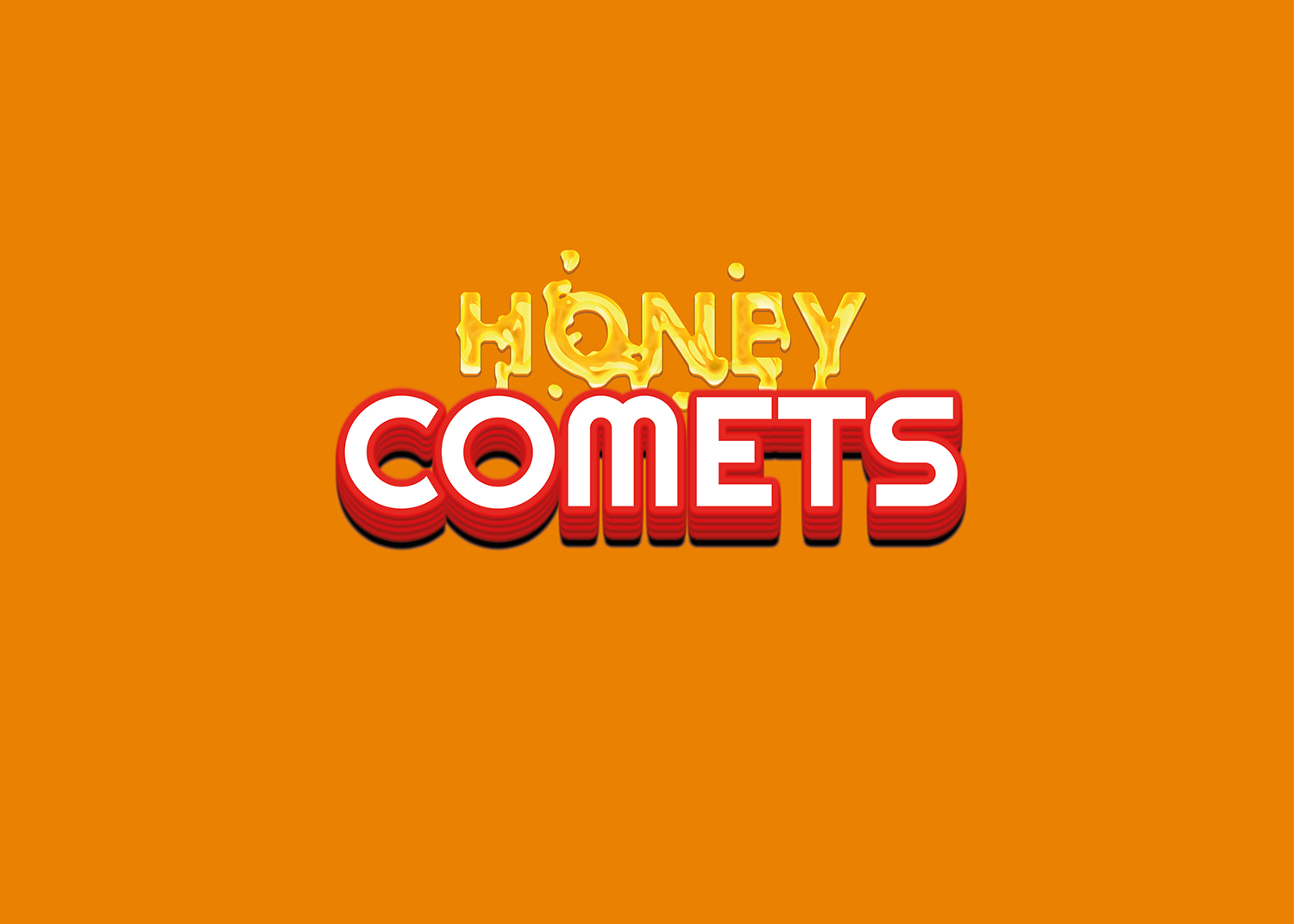
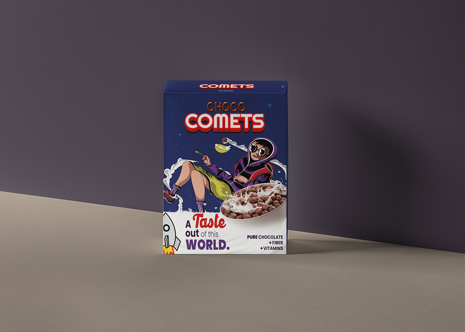
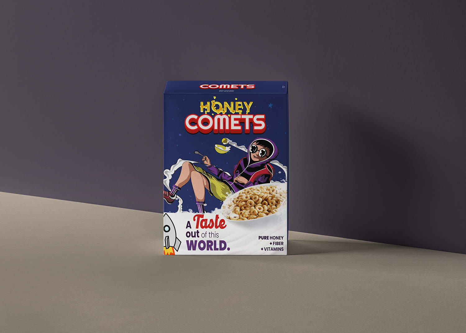
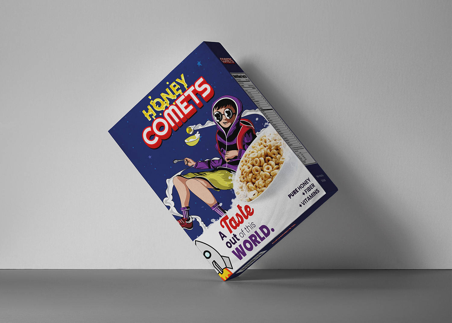
The brand needed to create a logo for that would be displayed on the packaging of the cereal boxes. COMETS is available in two flavors and it was requested that the two packagings resemble each other as much as possible. Being part of the ‘Explorer’ design archetype, they wanted the visuals to match this personality and tone of voice.
The illustration/ mascot of the brand is a young explorer lost in his imaginary universe, floating around with his bowl of cereal. Kids being naturally curious and prone to space related games and cartoons are easily attracted by this theme and illustration. The font chosen is bold and easy to read, having a touch of vintage/ space/ arcade look to create a contrast with the colorful illustration.
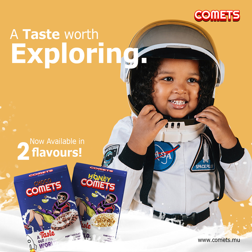
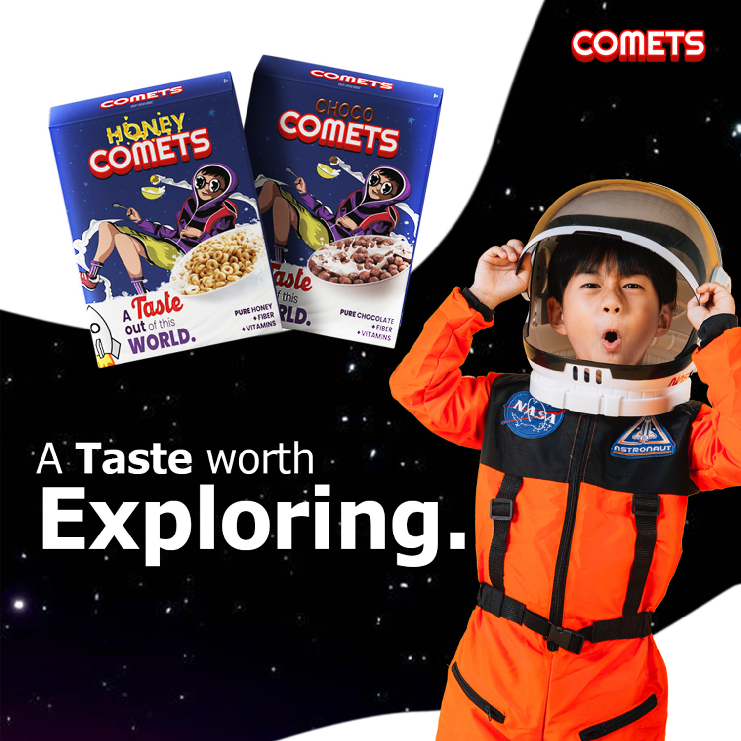
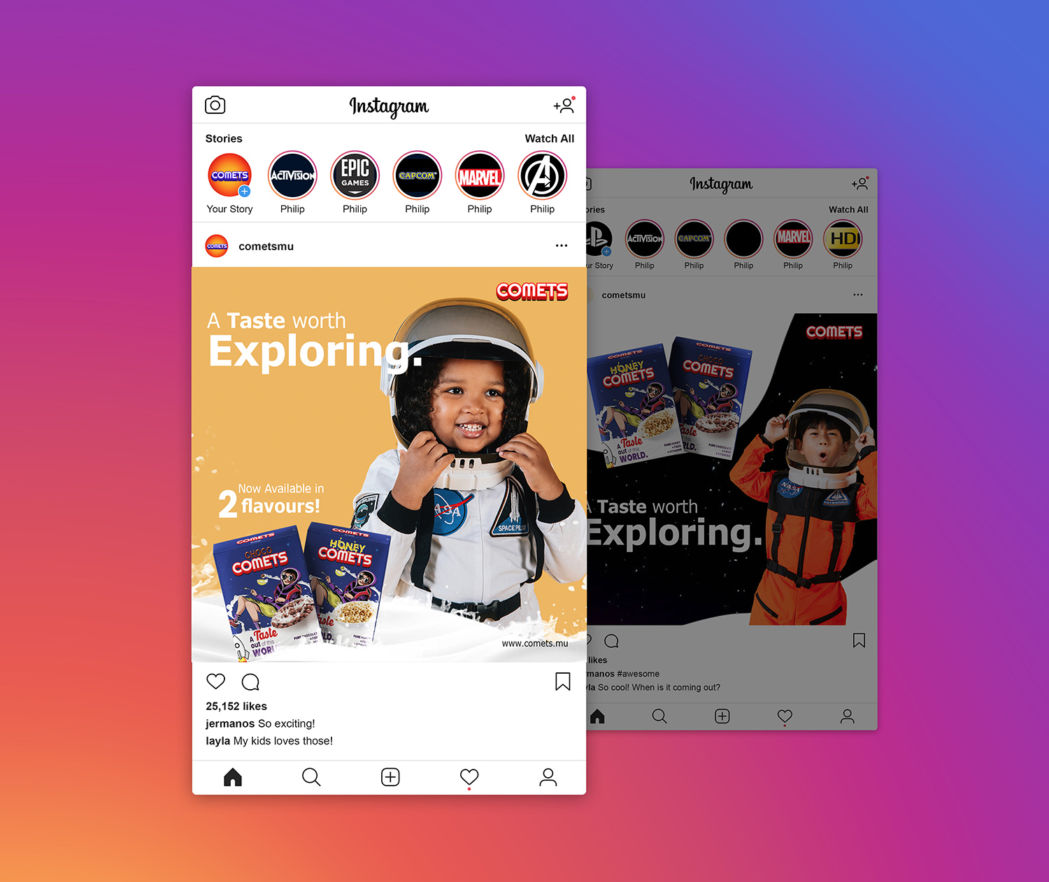
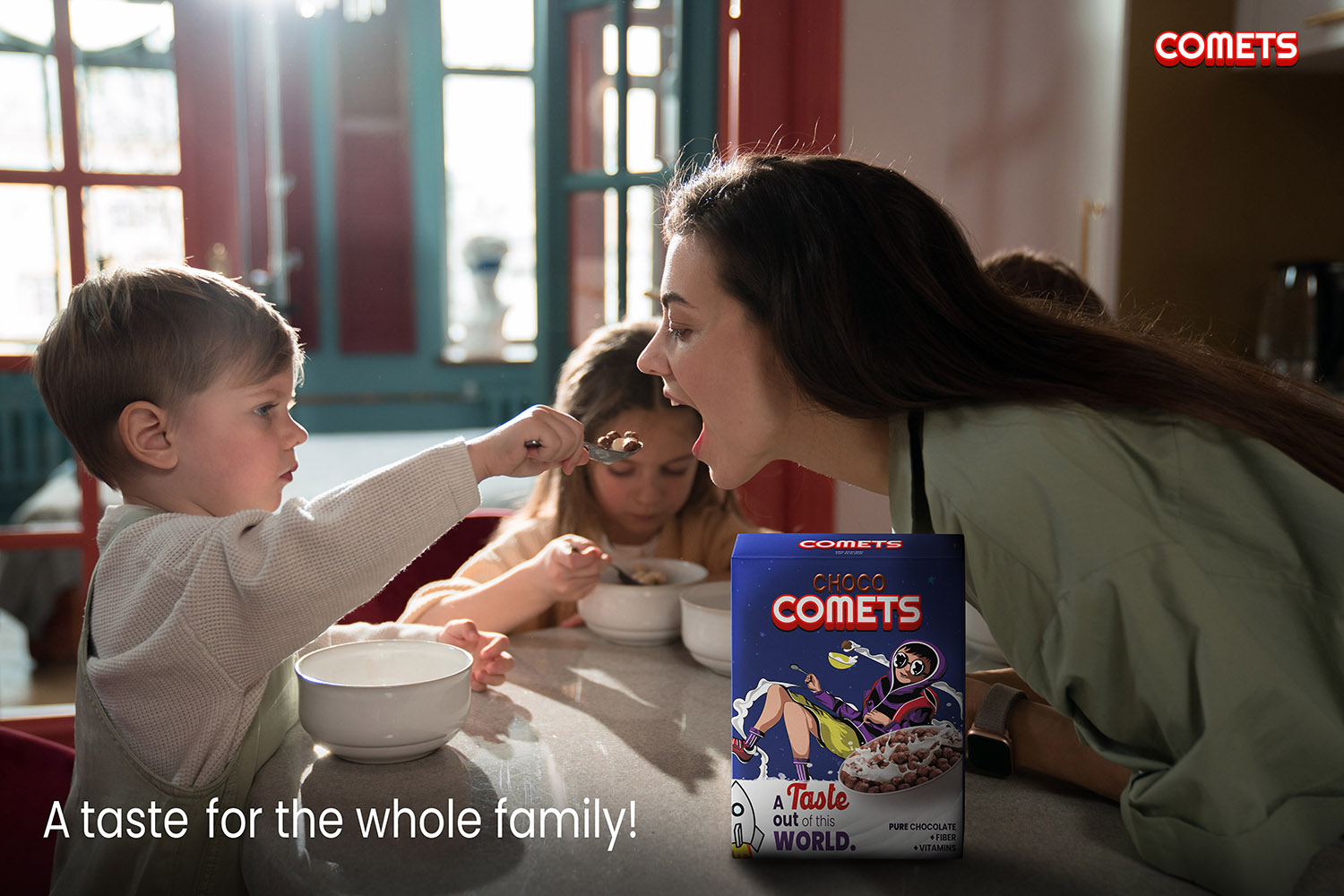
The method of advertising is mainly by the packaging itself but also by social media, thus little astronauts were used as a center of focus together with the cereal flavors. The texts are written simple and as clear as possible for social media.

